Project 02

Bluemercury

Lead UX Researcher
Project Brief

The UX audit for Bluemercury aimed to assess the storefront’s customer experience and guide future feature enhancements based on optimal UX. I was set to review bluemercury.com to evaluate their current e-commerce practices, feature functionality, and provide recommendations to improve the overall user experience. I did so by doing a UX audit that included a Heuristics Audit, Competitive Analysis, User Proto-Personas, Customer Journey Maps.

Duration

2 months

Tools Used

Figma, Figjam, Hotjar (Heatmaps)

Deliverables

Competitive Analysis, Heuristics Evaluation, Proto-Personas, User Journeys

4-Brand Competitive Audit
6 Core Flows Redesigned
29% in-app purchases

The Problem

The Problem

Bluemercury’s current storefront was in need of an in-depth analysis to identify its strengths and areas for improvement in providing a user-friendly experience. They were looking to:

  • Assess e-commerce best practices and feature-functionality

  • Enhance overall user experience and inform recommendations for the future state of bluemercury.com

Additionally, findings from this assessment would provide valuable insights to the Analytics team for testing and support the rebranding efforts of Bluemercury's branding team.

The Solution

The Solution

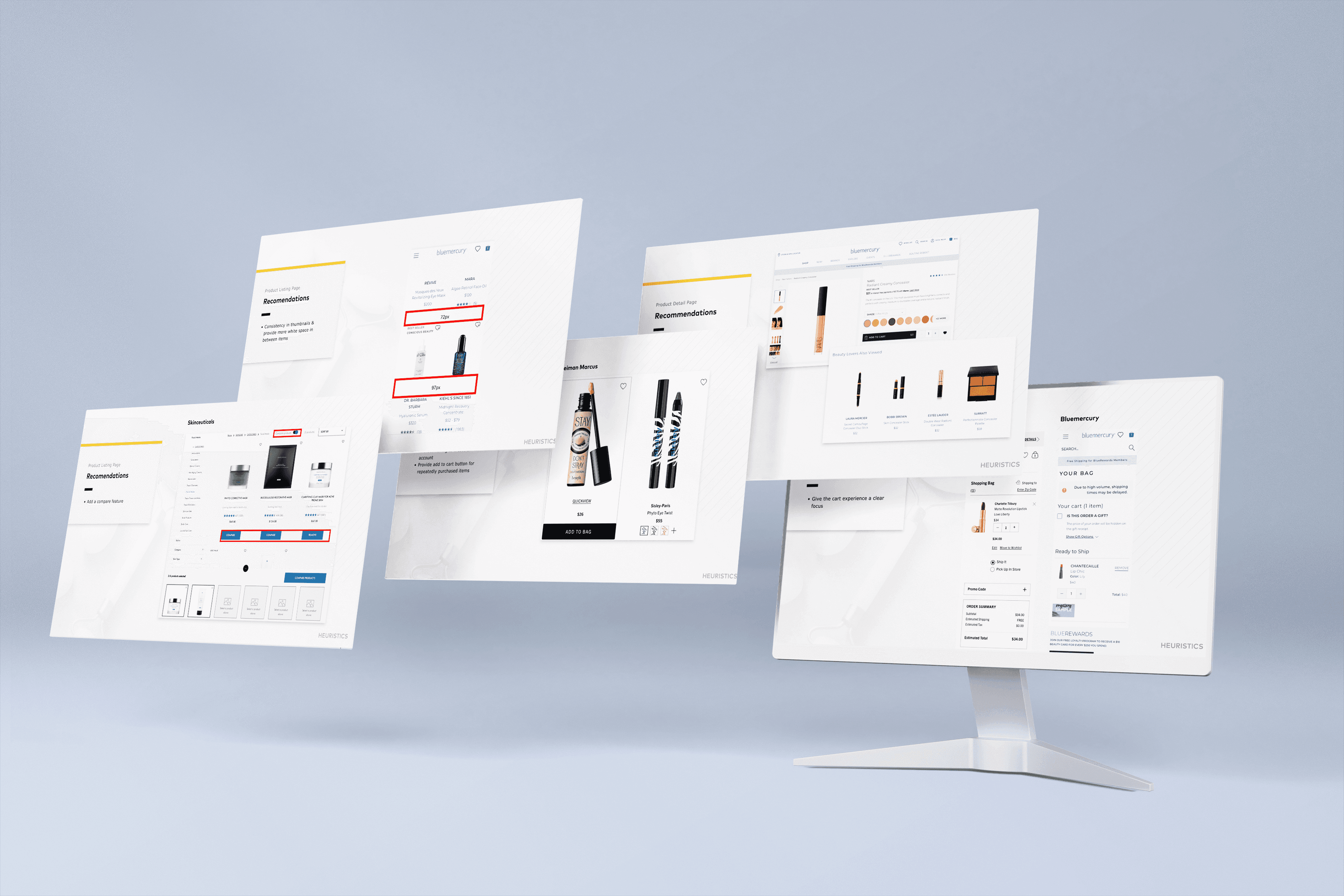
We developed a comprehensive roadmap that distilled our most insightful and effective recommendations from the UX Audit. This roadmap outlined a clear and strategic path forward, highlighting the key steps and implementation strategies necessary to provide a human centered e-commerce experience.

The Process

Auditing the storefront to Inform the Roadmap

Leading our research initiatives, we conducted a comprehensive competitive audit to benchmark industry standards and identify key opportunities for differentiation. A detailed heuristics audit followed, uncovering critical usability issues and areas for improvement. To deeply understand user experiences, I led the mapping of user journeys, highlighting pain points and moments of delight. Finally, we developed proto-personas to embody our target users, guiding design decisions and ensuring user-centric solutions throughout the project.

SWOT ANALYSIS

Mapping the competitive landscape

Mapping the competitive landscape

To identify strategic opportunities for Bluemercury, I conducted a comprehensive SWOT analysis evaluating direct competitors: Sephora, Ulta, Violet Grey, and Saks. By analyzing their Product Listing Pages (PLP), Product Description Pages (PDP), and Add-to-Cart flows, I pinpointed industry standards and critical usability gaps to inform a more accessible, user-centric roadmap.

01
Strengths: Robust Product Discovery & Feedback
  • Competitors excel in building consumer confidence through detailed review sections.

  • Competitors showcase variations in Product Listing Pages (PLP), providing a strong overview of available products.

  • Sephora and Saks utilize dynamic thumbnails that adjust based on user inputs or hover interactions, aiding in quick visual validation.

Strengths: Robust Product Discovery & Feedback

01
  • Competitors excel in building consumer confidence through detailed review sections.

  • Competitors showcase variations in Product Listing Pages (PLP), providing a strong overview of available products.

  • Sephora and Saks utilize dynamic thumbnails that adjust based on user inputs or hover interactions, aiding in quick visual validation.

01
Strengths: Robust Product Discovery & Feedback
  • Competitors excel in building consumer confidence through detailed review sections.

  • Competitors showcase variations in Product Listing Pages (PLP), providing a strong overview of available products.

  • Sephora and Saks utilize dynamic thumbnails that adjust based on user inputs or hover interactions, aiding in quick visual validation.

02
Weaknesses: Aesthetic Prioritization Over Usability
02
Weaknesses: Aesthetic Prioritization Over Usability
02
02
Weaknesses: Aesthetic Prioritization Over Usability
03
Opportunities: Elevating Accessibility and Core Navigation
03
Opportunities: Elevating Accessibility and Core Navigation
03
03
Opportunities: Elevating Accessibility and Core Navigation
04
Threats: Shifting Consumer Expectations Toward Utility
04
Threats: Shifting Consumer Expectations Toward Utility
04
04
Threats: Shifting Consumer Expectations Toward Utility

FEATURED DESIGN

Heuristics

We sought to enhance the user experience by systematically conducting a Heuristic evaluation to identify and address any design flaws, navigation challenges, or usability issues that may be impacting the overall user experience of blue mercury.

ADD FEATURE IMAGE

FEATURED DESIGN

Heuristics

We sought to enhance the user experience by systematically conducting a Heuristic evaluation to identify and address any design flaws, navigation challenges, or usability issues that may be impacting the overall user experience of blue mercury.

SWOT ANALYSIS

EXPERIENCE MAPPING

To identify strategic opportunities for Bluemercury, I conducted a comprehensive SWOT analysis evaluating direct competitors: Sephora, Ulta, Violet Grey, and Saks. By analyzing their Product Listing Pages (PLP), Product Description Pages (PDP), and Add-to-Cart flows, I pinpointed industry standards and critical usability gaps to inform a more accessible, user-centric roadmap.

ADD JOURNEY IMAGE

01 / 04

Streamlining Product Discovery

Mary seeks a clean, efficient experience to maintain her skincare routine. Her main friction points are disruptive pop-ups, disorganized product comparisons, and the inability to save items for later.

Streamlining Product Discovery

Streamlining Product Discovery

Mary seeks a clean, efficient experience to maintain her skincare routine. Her main friction points are disruptive pop-ups, disorganized product comparisons, and the inability to save items for later.

Reducing Decision Fatigue

Reducing Decision Fatigue

Anthony shops for luxury gifts but struggles with overwhelming choices and lost cart item comparisons. Another major failure point is the digital gift card flow, where emails appear untrustworthy.

Mary Smith · The Efficient Professional

Mary Smith · The Efficient Professional

Mary, a 35-year-old lawyer, seeks a fast, automated e-commerce experience for her skincare routine. Her primary frustrations are disruptive pop-ups, disorganized product comparisons, and the inability to save items directly from her cart.

Anthony Lee · The Generous Shopper

Anthony Lee · The Generous Shopper

Anthony, a 40-year-old entrepreneur, shops for luxury gifts but suffers from decision paralysis. His journey breaks down due to an overwhelming volume of choices and digital gift card emails that appear untrustworthy.

1 / 4

CONCLUSION

Lessons learned Next steps

Despite having limited time for traditional UX research, we successfully developed a roadmap that delivered significant, impactful changes. Our deep dive into user behavior and pain points enabled us to provide actionable insights, empowering Bluemercury to enhance their e-commerce experience with a human-centered approach. As a result of our audit, Bluemercury has not only seen a remarkable 16% increase in sales but is also actively working to redesign their website to be more more user-centric and set the bar for its competitors.

3D Lion (Background Removed)

Let's Connect

Let’s Create Human Centered Experiences.

3D Lion (Background Removed)

Let's Connect

Let’s Create Human Centered Experiences.

3D Lion (Background Removed)

Let's Connect

Let’s Create Human Centered Experiences.